The Butter People
The Butter People
The Butter People create small-batch, Western Australian butter, gently crafted from premium ingredients. They are proud supporters of ethical and sustainable dairy farmers, and only source cream from a herd of the happiest grass-fed cows. Their award-winning products have been featured on Urban List, The West Australian and MasterChef Australia.
The Butter People needed a brand overhaul. They required something that represented the premium quality of their product, their commitment to all things butter, and their fun and quirky brand personality.
Beginning with customer and market research, a in-depth creative strategy process then lead the designs.
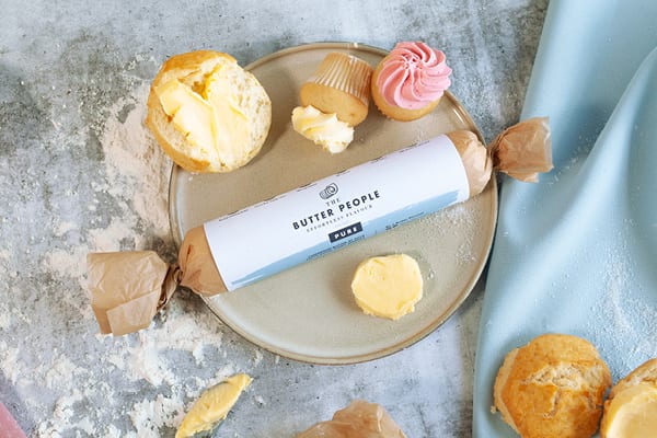
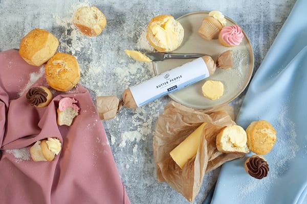
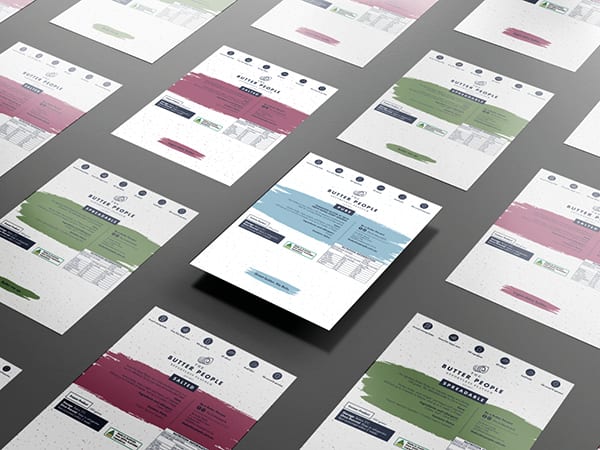
The logo blends modern and classic typefaces, to allude to their contemporary, progressive, brand persona as well as their more traditional, artisan roots. A hand-drawn butter curl motif provides an earthy edge and memorability. The packaging design utilises bespoke ‘butter spread’ shapes as design devices, and a unique ‘speckle’ background reminiscent of marble. This detail gives the brand a premium feel and allows for the use of negative space without becoming boring. A set of icons was designed to highlight the product benefits.
A friendly tone-of-voice was established, featuring a series of fun dairy-related puns. (“Legen-dairy butter!” “Great butter. No buts.” “Butter me up!” “Butter-bing! Butter-boom!”) This language was used throughout the collateral, giving the brand an approachable and warm vibe.
![]()


![]()
Photography by Elise Adrian Photography
Client: The Butter People
Service: Branding and packaging design